The
Development of a Warm Weather Relative Comfort Index for Environmental
Analysis
Funded by the National Climatic Data Center, Asheville, NC
Jill Derby Watts
Synoptic Climatology
Laboratory
Center for Climatic Research
Department of Geography
University of Delaware
Newark,
DE 19716
INTRODUCTION
Numerous indices have been developed over the years that give a measure
of human physical comfort as it relates to weather conditions (Hevener,
1959; Masterton and Richardson, 1979; NWS, 1992; Steadman, 1984; Thom,
1959). These indices range from simple combinations of temperature
and/or humidity and wind to the inclusion of solar radiation, altitude,
and numerous physiological, clothing, and heat transfer variables.
However, virtually all of the indices are derived solely on absolute conditions
and do not consider relative stress and adaptation based on location and
time of season. Kalkstein and Valimont (1986, 1987) developed a relative
index called the Weather Stress Index (WSI), which accounts for hourly
apparent temperature values, but excludes other important meteorological
parameters related to heat stress. The WSI was never officially adapted,
and there is no evidence of any other relative indices being previously
developed.
A summer relative comfort index, the Heat Stress Index (HSI), has been
developed to improve upon the limitations of the current, widely-used comfort
indices, as well as the shortcomings of the WSI, and can be useful in numerous
environmental applications. The index has the ability to evaluate daily
mean relative stress values for each first-order weather station in the
United States. It includes variables not used in previous indices,
such as a factor that considers consecutive days of stressful weather,
cloud cover, and accumulation of heat through the day. In addition,
the index has been designed to fit seamlessly into NWS forecasts, permitting
daily values to be calculated for time periods up to 48 hours in advance.
METHODOLOGY
The index was created based on 30 years of data (1971-2000) for over 240
first-order weather stations across the continental United States.
This section describes the steps necessary to create the HSI for each location
and summer month (June August) (see NOTE at end of manuscript).
The
first step was to run the 30 years of hourly data through the
Steadman apparent temperature algorithm (software available from NCDC)
for each summer month and location. The output of this model included
temperature, relative humidity, wind speed, cloud cover, extra radiation,
and the calculation of apparent temperature (AT).
The
second step was to determine and calculate the five parameters
related to heat stress. These consisted of daily maximum and minimum
apparent temperature values (ATMAX and ATMIN), cooling degree days (CDD),
mean cloud cover (CCMEAN), and the number of consecutive days of extreme
heat (CONS). Each variable could be easily calculated based on the
Steadmans AT model output.
· ATMAX
(ATMIN) is the highest (lowest) hourly AT value recorded over a 24-hour
period. ATMIN is just as important as ATMAX because high daily ATMINs
add stress to the day.
· CDD
accounts for temperature fluctuations such as those often associated with
temperature drop after the onset of a thunderstorm or passage of a cold
front, which can bring relief to an otherwise stressful situation.
The CDD variable is calculated by summing the number of degrees above an
hourly apparent temperature of 18.3 °C (65 °F) over a 24-hour period.
· CCMEAN
represents the average hourly cloud cover values from 1000-1800 LST.
These hours were chosen because clear skies during the daytime generally
raise temperatures and add stress due to an increased solar load (Kilbourne,
1997).
· CONS
is included in the index because there is a negative human health impact
of extreme weather that increases with each day that conditions persist
(Kalkstein and Davis, 1989; Kilbourne, 1997). A consecutive day was
counted when the ATMAX value was at least one standard deviation above
the AT mean. The count increased with each consecutive day that ATMAX
exceeded the threshold, but dropped back to zero when conditions were not
met or the day was missing.
The third step involved fitting a statistical distribution to each
of the variable frequencies. Variable frequency patterns for every
month (see NOTE at end of manuscript) and station were considered,
and a distribution was chosen that was deemed the best overall fit.
A probability distribution function fit was preferable, but in the case
of CCMEAN the frequency patterns varied significantly from one station
to another, so an empirical fit was the best option. An empirical
fit (Fig. 1) means that the curve was fit directly to the frequency value
of each observation rather than approximated or smoothed. ATMAX,
ATMIN, and CDD frequencies were approximated by beta distributions (Figs.
2 - 4). A negative binomial distribution was fit to the CONS frequencies,
because it did the best job capturing the overwhelming number of zero consecutive
days that were consistently present at every location each month (Fig.
5).

Figure 1. Example of an empirical distribution fit to July cloud
cover frequencies for Philadelphia, PA.

Figure 2. Example of a beta distribution fit to July maximum apparent
temperature frequencies for Philadelphia, PA.

Figure 3. Example of a beta distribution fit to July minimum apparent
temperature frequencies for Philadelphia, PA.

Figure 4. Example of a beta distribution fit to July cooling degree
day frequencies for Philadelphia, PA.

Figure 5. Example of a negative binomial distribution fit to July
consecutive day frequencies for Philadelphia, PA.
The fourth step in creating the index was the determination of daily
values for each variable based on their location under the distribution
curves. The purpose of this step was to place all the variables into
the same set of units. The daily value of each variable was established
based on the probability that a typical daily parameter was less than the
actual daily parameter. A cumulative distribution function (CDF)
was used to calculate the area under the curve, up to the given daily value
of the variable.
Each cumulative probability value can be expressed as a percentile, and
therefore, each daily value was referenced in terms of a percentile.
Since the probabilities range from 0.0 to 1.0, they can also be said to
range from 0% to100%. A value of 0.75 can be described as being in
the 75th percentile, indicating that 75% of days are associated with a
lower parameter value than that particular days parameter. An example
of the weather variables representing conditions on July 4, 1999 in Philadelphia,
Pennsylvania, and their corresponding daily percentage values based on
their location under the curves (Figs. 1 - 5) is given (Table 1).
Table 1.
Philadelphia, PA weather variables and their corresponding daily values
for July 4, 1999.

The fifth step required the summation of the five variable daily
percentage values for each day and location. The summation was simply

Sum values, SUM, varied between 0.0 and 5.0. The higher the SUM,
the more stressful the day since daily values closest to 1.0 (or 100%)
indicate the worst conditions that could occur for that month at a given
station. CCMEAN had to be subtracted from 1.0 to account for the
fact that clear, rather than overcast, conditions add the most stress to
a daytime situation. The summation value based on the Philadelphia,
PA example (Table 1) equals 4.13.
At first each variable was weighted equally
during the summation process. However, due to collinearity among
the variables, it seemed more logical to weight them based on their uniqueness
within the dataset. An attempt was made to use non-rotated principal
components analysis (PCA), which is a multivariate statistical procedure
designed to remove intercorrelation between variables, and is described
in detail by Daultrey (1976). PCA was performed for each month and
station using a dataset that consisted of all the variable percentage values
over the 30-year period. However, results were problematic and non-intuitive,
so it was necessary to apply equal weights to the variables.
The sixth step was to fit a distribution to
the summed values by following similar guidelines as to those given in
the third step. The beta distribution function was chosen based on
the overall summation frequency patterns for each month and location.
Last, the seventh step was the calculation
of index values for every summer day within each stations 30-year dataset
based on the location of the SUM variable under the beta distribution curve
(similar to the fourth step). The SUM accounted for all 5 variables
included in the index, so when a combination of these variables produced
a stressful result, the SUM was near 5.0 and that was close to a 100% day.
For example, July 4, 1999 in Philadelphia, PA was a 97% day (Fig. 6).

|
97%
Figure 6. Example of a beta distribution fit to July summation frequencies
for Philadelphia, PA. July 4, 1999 is represented as the 97th percentile.
RESULTS
The variable frequency curves (Figs. 7 12) had the following major
characteristics:
· ATMAX and ATMIN ranges were much greater in the northern portion
of the country than in locations further south.
· ATMAX, ATMIN, CDD, and the CONS baseline (value equal to one
standard deviation above AT mean) tended to increase with decreasing latitudes,
except within mountainous regions.
· CONS equivalent to zero was dominant throughout the country.
· ATMAX, ATMIN, CDD, and CONS baseline variables were always
lowest during the month of June and almost always at their peak in July.
· CCMEAN patterns varied spatially but not within the summer
season at individual stations. There was a dominance of clear skies
in the West that progressively became cloudier towards the East such that
the East Coast was cloudier throughout the summer.
· SUM frequency distribution curves had no obvious spatial or
monthly patterns.


To verify the relative and systematic nature of this
index, the HSI results were thoroughly analyzed. The results were
evaluated based on what was known about an individual station and how it
compared with other stations. Here are some of the findings:
· Top ranking days had fairly clear sky conditions and occurred
during a string of stressful days. The variable percentages associated
with apparent temperatures also represented some of the most stressful
conditions that could occur during that time of the year.
Just the opposite was true of the lowest ranking days. (Tables 2 3)
Table 2. Weather conditions associated with the ten most stressful
days in Cheyenne, WY, 1971-2000. Individual variable percentage values
indicated in parentheses.

Table 3. Weather conditions associated with the ten most stressful
days in Des Moines, IA, 1971-2000. Individual variable percentage
values indicated in parentheses.

· Individual stations required much higher apparent temperatures
in July and August to indicate a stressful day compared to those conditions
that would report a similar index value in June.
· Stations from various climate regimes had different criteria
defining an excessive heat stress event. For example, a highly stressful
day in Philadelphia, PA would likely be an average day in Baton Rouge,
LA. (Table 4)
Table 4. Comparison of Heat Stress Index values assuming the same
weather conditions applied at various locations.

· Generally, neighboring stations had similar HSI results, because
they were located in the same climate region and were being affected by
the same air mass. The times when the results
differed can be explained in three ways:
1. The elevation between two stations varied significantly,
so the monthly variable curves were consistently different because apparent
temperatures are lower at higher elevations.
2. ATMAX hovered close to the CONS baseline values
at both stations. Often one station reached its CONS baseline value
and began counting consecutive days, while the other count remained or
returned to zero.
The HSI values always jumped significantly when CONS rose above zero.
3. Surface fronts and troughs were traversing the
area, influencing the weather at one location more than the other.
Typically the station most affected had cooler apparent temperatures and
significant
cloud cover, which lowered
the overall index value.
To test the effectiveness of the HSI, Philadelphia,
PA index results were compared with elderly mortality data. The mortality
data was also compared with Steadmans AT mean values in an effort to illustrate
the usefulness of the HSI (Figs. 13 14). While there was an upward
trend in mortality as both index values increased, the highest mortality
days are better associated with the highest HSI values. This is because
the HSI has the ability to incorporate other important variables that have
been linked to causes of mortality. However, a high HSI day does
not necessarily mean more deaths occurred. By mid to late summer
people become more acclimated to the heat, resulting in less deaths on
high index days.
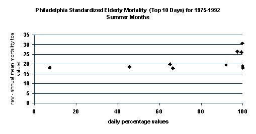
Figure 13. Top 10 mortality days plotted against the Heat Stress
Index values.

Figure 14. Top 10 mortality days plotted against the mean AT values.
Predicting days with higher mortality is just one
potential application of the HSI. The HSI also has the ability to
be incorporated into NWS forecasts. The index can be calculated 48
hours in advance using the AVN/MRF forecasts, which are updated twice daily.
During the summer of 2001, two television stations tested the index to
determine the publics reaction to a relative index. The NBC and
CBS affiliates in Philadelphia, PA and Baton Rouge, LA, respectively, announced
the HSI forecasts during their broadcasts from June through August.
A numerical and descriptive scale was utilized such that: 0-3 was
cool, 4-6 indicated comfortable conditions, 7-8.9 represented an uncomfortable
day, 9.0-9.5 was severe, and 9.6-10.0 meant conditions were extreme.
Viewers were asked to answer an online questionnaire so they could express
their opinion about the relative index and how it compared to the highly
publicized heat index. The overall results were positive (see Appendix),
which may prompt the HSI to be tested at several television stations throughout
the country beginning next summer. This could encourage the NWS to
seriously consider using this index in their forecast products.
If work progresses with the HSI, there are some improvements
that should be made to improve results. One of the important changes
would be to create weekly variable frequency distributions for June and
August rather than have one curve represent the entire month (see NOTE
at end of manuscript). The transitional June and August weather
patterns are not captured by the current curves, because the average conditions
in early June and late August lower the average of the entire month.
One other way to handle this shortcoming would be to compare a June or
August day with a weighted moving average, which represents 5-10 days before
and after the given day.
Some additional corrections that should be considered
include:
· Determining if there is a way to weight the variables to increase
the accuracy of the HSI rather than giving equal weight to each.
Performing a principal component analysis (PCA) on the variables was
unacceptable, but there may be other procedures that can be
used to assign a better weight.
· The use of an arithmetic fit or a mixture of distributions
to represent the SUM frequency distributions. The Beta distribution,
currently employed, is a good approximation, but does not represent the
highest
SUM values as accurately as one would like (see NOTE
at end of manuscript).
· Utilizing a better forecasting model than the AVN/MRF.
One shortcoming of the AVN/MRF is that it often forecasts slightly cooler
temperatures than what actually occurs. This means that the forecasted
HSI values may not accurately represent the stressfulness associated
with the actual conditions.
Despite these potential shortcomings, the Heat Stress
Index is clearly an improvement over other indices. Most important,
this index considers relative stress and adaptation based on spatial and
temporal conditions. Second, the relative index includes parameters
that have never been incorporated into other indices, but are proven contributors
to heat stress. Last, the Heat Stress Index could benefit both the
operational and research fields with its ability to be used in numerous
environmental applications.
NOTE: The Heat Stress Index was
modified in Spring 2002 to improve upon some of the shortcomings mentioned
above. Most importantly, 10-day frequency distribution curves (i.e.
June 1-10, June 11-20, June 21-30, etc.) were created to replace the monthly
curves that were implemented originally. The index has also been
extended to include the months of May and September. Last, a calculation
correction to the SUM frequency distribution curves was also made to improve
upon the index's accuracy.
REFERENCES
Daultrey, S., 1976: Principal components analysis. Concepts and
Techniques in Modern Geography, 8, 1-51.
Hevener, O. F., 1959: All about humiture. Weatherwise, 12,
56, 83-85.
Kalkstein, L. S. and K. M. Valimont, 1986: An evaluation of summer
discomfort in the United States using a relative climatological index.
Bull.
Amer. Meteor. Soc., 67, 842-848.
Kalkstein, L. S. and K. M.. Valimont, 1987: An evaluation of winter
weather severity in the United States using the weather stress index. Bull.
Amer. Meteor. Soc., 68, 1535-1540.
Kalkstein, L. S. and R. E. Davis, 1989: Weather and human mortality:
An evaluation of demographic and interregional responses in the United
States. Ann. Assoc. Amer. Geographers, 79, 44-64.
Kilbourne, E. M., 1997: Heat waves and hot environments. The Public
Health Consequences of Disasters. Oxford University Press, New York,
245-269.
Masterton, J. M. and F. A. Richardson, 1979: Humidex, a method of quantifying
human discomfort due to excessive heat and humidity. Environment Canada,
45. pp.
NWS, 1992: Non-precipitation weather hazards (C-44). WSOM Issuance,
92-6,
5-7.
Steadman, R. G. 1984: A universal scale of apparent temperature. J.
Climate Appl. Meteor., 23,1674-1687.
Thom, E. C., 1959: The discomfort index. Weatherwise, 12, 57-60.
Appendix
This is a copy of an email sent by Dr. Larry Kalkstein to several
people involved in the experimental use of the Heat Stress Index.
It provides a good summarization of the website questionnaire results.
Hello all,
We received about 50 responses from Philadelphia and about 100
from Baton Rouge. The reason for the number disparity (we believe)
is because the index was presented during every weathercast in Baton Rouge,
but usually only during "hot" periods in Philadelphia. So the Baton
Rouge audience, in our opinion, was more exposed to the index. One
other important factor needs to be mentioned. This was a relatively
"cool" summer in Baton Rouge, with virtually no very hot days with index
values above 9. Although the summer was not unusually hot in Philadelphia,
there were a number of days with values of 9 or greater.
The viewers were quite positive about the index. When asked to
evaluate the Heat Stress Index, over 90 percent of the Philadelphia viewership
described it as "easy" or "very easy" to understand. This number
was a somewhat lower 64 percent for Baton Rouge. The majority of
the Philadelphia viewers thought that the Factor was more accurate than
the heat index, and only 2 percent thought that it was less accurate.
The results for Baton Rouge were again not as impressive but still good,
and more people thought that the Factor was more accurate than the heat
index than less accurate. Interestingly, 5-10 pecent of the viewership
were not familiar with the heat index. Most people did find the Factor
useful. In Philadelphia, almost 60 percent of the viewers said they
used the information more than 5 times per month, and almost 90 percent
used it at least "occasionally". Sixty percent of the Baton Rouge
audience used the information at least occasionally. Finally, the
vast majority in both cities said that the Factor should continue to be
used. This number was 98 percent for Philadelphia, and 70 percent
for Baton Rouge.
We are curious why the Philadelphia audience had a more positive
reaction than the Baton Rouge viewers. I've talked to the on-air
meteorologists at Baton Rouge (Mike Graham and Jay Grymes), and both
made it clear that the very average summer there led to many values
of the Factor of less than 5. Clearly, the lack of a heat wave in
Baton Rouge this summer must have dampened some enthusiasm for the Factor.
Nevertheless, the majority of the Baton Rouge viewership still thought
positively of the index, although not as enthusiastically as the Philadelphia
viewership.
We were pleased to see that positive comments outnumbered negative
by about 2-1. The Philly written comments were generally more positive
than those from Baton Rouge; we again attribute this to the fact that there
was some extreme weather this summer in Philly while in Baton Rouge, most
reported values were 5 or less due to a relatively "cool" summer.
I've gotten messages from both Mike Graham and Jay Grymes (the Baton Rouge
on air meteorologists), who also believe this is the case.
Most of the positive comments were indicative of people who fully
understood the index and found it more informative than the heat index.
However, I want to concentrate more on the negative comments to try to
understand these. Some said they preferred the heat index, noting
that it is easier to understand. Others seemed to indicate that no
index is necessary (eg. "What a joke. If it's hot... it's hot" or
"We're not idiots. We understand a simple temperature"). One or two
didn't understand why Baton Rouge people were getting values from Delaware.
A few more did not agree that a relative index provides more information
than an absolute one.
As Jill and I look over all the results, we believe that the experiment
has shown that a clear majority of the people not only understand a relative
index, they would like to see it on tv. We are already
convinced that the index will be useful for research purposes, based
on our previous work on human health response to weather. Jill and
I additionally think that this can be a very useful tool for on-air meteorologists,
with the following caveats that I would like to discuss with all of you:
1. Don't replace the heat index, supplement it with the heat stress
index.
2. Use the factor to educate the public that we respond to weather
generally in a relative, rather than an absolute, fashion.
3. Show the factor with much greater frequency during unusual or extreme
conditions. It is probably unnecessary to show it much during cooler
than average conditions, but it should be shown occasionally at these times
so people remain familiar with the concept.
4. Make certain that the public understands exactly how it works.
After seeing the pieces aired by both stations, I want to commend them
for having explained the factor clearly to their audiences. Of course,
some people will never get it, but this experiment indicates that a sizable
majority will.
5. Have a meeting or a telephone conference call between NCDC, the
on-air meteorologists, and Jill and me on how we can improve dissemination
of the product for next summer season.
6. Begin to get the National Weather Service in the loop. Some
know of our experiment, such as the meteorologist in charge for Philly
(Gary Szatkowski), and to a lesser extent the meteorologist in charge for
New Orleans (Paul Trotter, whom we are also working with on a heat stress
project). I will also make certain that the NOAA/NWS/Office of Meteorology
(my contact: Dr. Bob Livezey) understands fully what we are doing with
this product.
7. Hopefully expand the experiment next year to more markets.
In my opinion, we are not yet ready to make this a national product.
I'm sure there are more suggestions that you can all offer, so let's
set up a time to discuss, either in person or by phone. I will talk
with my NCDC colleagues to see how they would like to handle this.
Thanks again, all, for a successful experiment, and Jill and I welcome
any personal feedback that you may have. Your cooperation was greatly
appreciated.
Best wishes, Larry
Copyright ©
University
of Delaware, 2001 December.
Synoptic
Climatology Lab
Comments, suggestions,
or questions may be sent here.